 Comparative Software Improvement Metric: Objectively scoring two versions of software
By Logicbroker | September 12, 2019
Goal
Measuring improvements between two versions of software.
Summary
The Comparative Software Improvement Metric (CSIM or CSI metric) looks to objectively define the potential for improvement and automation in two or more software systems that accomplish the same task. When using the CSI metric, it is important to recognize that it does not look to replace standard practices for improving the user experience (UX) of a system. Rather, it looks to assign a value to the potential (or difference) for automation, or improved backend logic/querying between two similar but different versions of software.
Interaction
The CSIM qualifies all interaction with software in three categories: clicking, typing, and navigating.
- Clicks are any interaction a user has with their mouse or keyboard where only one “click” is required to move along within the process.
- Typing is any interaction with fields or inputs that require the user to type something using their keyboard.
- Navigations (or redirects) are any time the server needs to navigate or bring the user to a different page to either move along the process, or bring the user to the end result.
Due to high variability in the different types of software technologies available, the CSIM does not assess the time involved for a server or computer system to process a request. It assumes that the software design already utilizes the most time-efficient technologies or practices, and only looks to assign a score to evaluate the amount of user interaction required to complete a task.
Scoring
When scoring two versions of software, a lower CSI score assumes a more streamlined process within an application, either through automation, or through improved querying.
The user (proctor) of the scoring metric assigns a weighted value to each of the interaction types when running the evaluation. Business or system needs determine the ratio for the weighted values. I.e., some users may find manual entry of data to be the biggest slowdown within their system; in this case, the weight for the typing category would hold more value than the weight for the navigation category. When comparing two variants of software, the weighted scale must remain the same between the two evaluations. When displaying results, the weights used to calculate the score must be clearly displayed and an explanation regarding why the weighted values were selected can be provided.
Example of Use
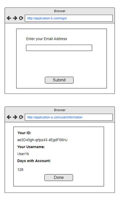
Imagine two web applications that allow users to access their internal ID number. The interface for one of the applications (Application-A) may look like this:
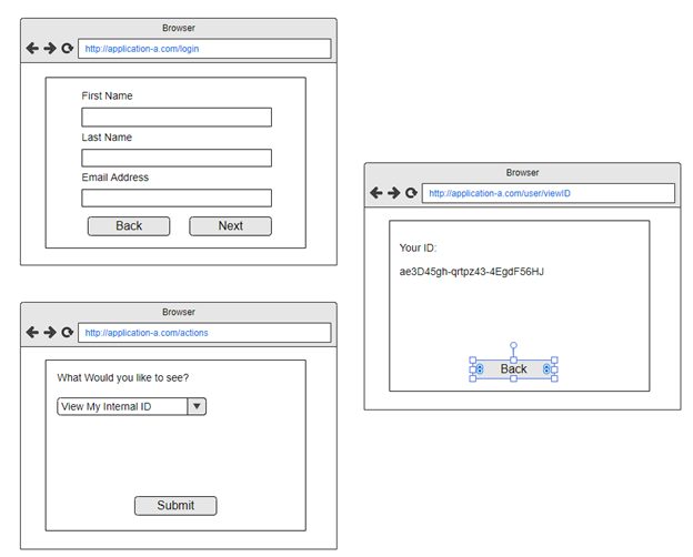
The user inputs three fields that are used to query records in the system. They then navigate to the next page, where a dropdown field allows them to select what record they wish to view. Once submitted, they reach the final page containing the desired information: their internal user ID.
**Important notes: Two pages need to load before the user accesses their internal ID.
Consider a possible re-design: Application-B
Application-B requires only one page load, minimizes user interaction, and contains improved querying that displays data the user may be interested in viewing.
While this example may sound extreme (most modern UX designers would never let Application-A get off the ground in that form), it demonstrates the way user interaction is increased if a design that considers streamlining the process is not taken. Some of the key aspects making Application-A less streamlined and usable than Application-B are the number of fields to input (3 vs 1) when making the initial query. Application-A then loads a new page, and requires the user to select which action they want to take. Finally, after selecting the action, clicking submit and then having a new page load, Application-A brings the user to the desired result.
In all, if a CSIM score were given to Application-A using an equal weight for all interaction types (1pt), Application-A would garner a score of 8. Here is the calculation:
- First page: 3 fields to enter, 1 click, 1 page load.
- Second page: 1 field to click/enter, 1 click, 1 page load.
- Third Page: Result
- Total: 8 interactions
Application-B, on the other hand, would receive a CSIM score of 3. Here is the calculations:
- First page: 1 entry, 1 click, 1 page load.
- Second page: Result
- Total: 3 interactions
Application B streamlines the process by allowing the user to enter less fields to achieve the desired result. That is a 62% reduction in the CSIM score and indicates a significant improvement in the design of the software version.
A Real Life Example: Convey Freight Shipments vs Logicbroker + Convey
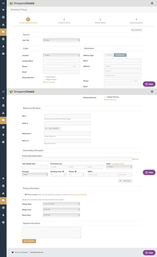
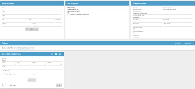
The Convey freight-scheduling portal allows users to create a bill of lading (BOL) and schedule a delivery pickup time and day for freight deliveries. During this process, users input a number of different fields like:
- Packaged Items
- Pallet Descriptions
- Ship-To Address
- Ship-From Address
- Address Type (Residential or Commercial)
- Package/Pallet Dimensions
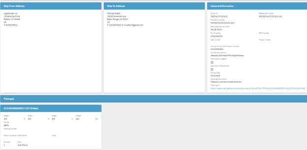
The UI built within Logicbroker to automate Convey data input minimizes user data entry in the following ways:
- Automatically selects lowest costing freight service
- No data entry for ship-to address
- No packaged Item data entry
- Destination details pre-populated
- No data entry for pallet descriptions
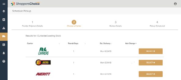
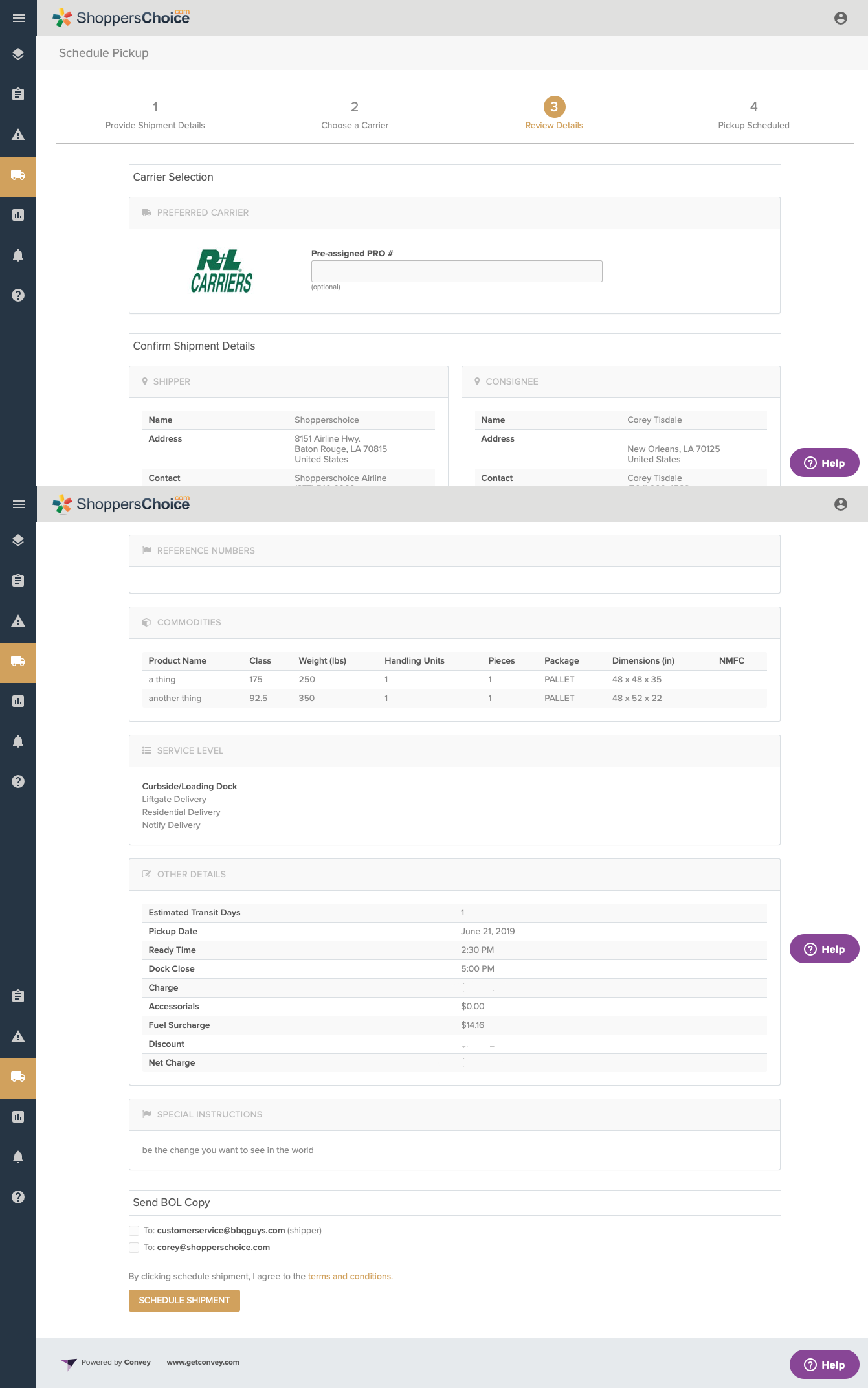
Samples of the Convey UI/Process
Step 1: Enter all item, dimension, delivery and order information, new page loads
Step 2: Select desired carrier, new page loads
Step 3: Review information and submit for freight pickup, new page loads. BOL becomes available.
After Step 3 is completed, the user clicks submit and then receives the BOL (desired result)
Compare that process versus Convey coupled with Logicbroker’s order and freight selection automation, to streamline the process.
Step 1: Input shipment data. Order data is pre-populated, shipment is submitted.
Step 2: Logicbroker sends the request to Convey, automatically selects the lowest priced freight provider (backend process), lastly, the BOL is received and populated on the same page.
The following scale was used to calculate the usability improvement between these two software versions:
Clicks – 1pt.; Navigation – 1.5 pt.; Typing – 2 pt.
Typing received a weight factor of 2 because minimizing the amount a user needs to type greatly reduces the amount of time spent scheduling the freight pickup. As noted in the sample images, Logicbroker uses data received from the order (through an API) to pre-populate a number of fields.
Navigation received a weight factor of 1.5. A primary goal of the project was to have the users input freight information, and then receive the result (final BOL) as quickly as possible, without having to navigate to a different page. This design allows users to receive the BOL without having to work through as many page prompts.
Clicking received a weight factor of 1. Due to the nature of each field needing to be clicked before typing, clicking would have an impact on the final score, but is weighed with the smallest relative value because the minimal effect on the overall process. Whenever a field requiring typing was removed, a click was removed as well. That prompted the use of a lower score for click interactions.
**Note: Both Logicbroker and Convey provide address book functionality, which reduces the amount of fields that need to be typed for “Ship From” fields. Due to this, a “short use case” and a “long use case” was evaluated for each software version. The evaluation for the long use case did not utilize the address book feature, and the results are displayed below.
Results:
Weights used:
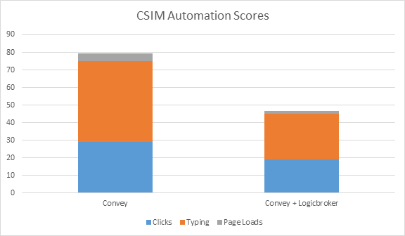
Clicks – 1 pt.; Navigation – 1.5 pt.; Typing – 2 pt.
Summary: While Convey’s software requires minimal field input for a freight request form, using Logicbroker in conjunction with Convey allows users to greatly minimize the amount of manual data entry needed (including items, PO number, shipping destination, etc.) These two systems combined provided a total CSIM score improvement of 41%
After completing the CSIM score evaluation, user feedback validated these findings, with some users mentioning an improvement of up to 5 minutes per shipment scheduled.
While the CSIM score does provide an objective scoring metric, it is important to obtain feedback from frequent users of the system to validate all findings. In this way, the data can be thoroughly validated, and any additional areas for improvement may be identified.
Modern dropship & marketplace solutions have never been so easy.
Are you ready to drive growth and gain unparalleled speed to market with a modern, scalable dropship or marketplace program? Fill out the form below to get in touch with our team:
